Always Be Testing: UXD Internship @ Vroom
My cross-functional team of interns redesigned and built additional functionalities for an internal tool that tracked and managed a/b tests and facilitated data-driven decision making.
Time: 10 weeks (Jun 2020)
Platform: Desktop web application
Release status: Deployed to the dev environment
Role:
Co-owned the end-to-end process with one other design intern from research and discovery, to design and testing
Created, maintained and applied customized Material Theme to the UI library
Created artifacts to facilitate shared understanding and to invite team input
Delight the product experience with illustrations and animations
Prototype demo
The V1 internal A/B testing tool had limited test management capabilities and was not built to fit existing workflows
Continuous A/B testing had been crucial in optimizing the Vroom experience and driving business growth.Google Optimize and Firebase had been the platforms of choice for managing tests on web and native apps. To achieve more flexibility and control over the data with running, analyzing and scaling experiments, an in-house web app had been in the works. We named this tool Always Be Testing (ABT).
In the initial discovery, the PM and UXD interns together…
Interviewed 10 engineers, PMs and stakeholders to understand the development process and vision for ABT;
Learned how a/b tests were implemented and run from a technical perspective;
Evaluated ABT v1 and identified design challenges in functionality, usability, visual design, and copywriting.
Personas
The MVP and V1 were focused on establishing basic functionalities like recording test attributes with a form and displaying and tracking stages in a dashboard. It was the expectation that ABT would be used in parallel to Google Optimize/Firebase until it was robust enough as a standalone tool. We identified a few big questions and design considerations to address during the internship project:
📈 Track and manage tests at scale: How might we maintain the discoverability of tests and test information while keeping the visual noise down, when the number of tests grows from 15 to 500, or even 5,000?
🔃 Integrate into existing workflow: It was key to clearly define how ABT connected to the Google platforms as well as Jira and the codebase. This would allow tests to be cross-referenced accurately, while providing shortcuts to reduce user frustration with the constant context switching.\
🛠 Empower data-driven decision-making: Even though we might be urged to test everything, we wanted to test smartly. ABT should encourage users to consider the why behind each hypothesis and result, and plan future tests based on past evidence.
🚗 Represent the identity of Vroom: Rather than a generic Material Design theme, we wanted this internal tool to deliver an efficient experience that felt “red & fast” in consistency with Vroom’s brand and culture.
We also made sure to define what was out of scope:
🔢 Data reporting and analysis: The internal stats engine was still in its early stages, so these functionalities would be handled by Optimize/Firebase.
Design Challenges & Decisions
The complete user flow of ABT. The lifecycle of an a/b test is highlighted in the yellow L shape.User flow
We discovered a mismatch between how ABT v1 and Optimize mapped the lifecycle of an a/b test, leading to confusion about all the possible test status changes in ABT. Because tests in ABT and Optimize should have a one-to-one relationship, we matched the flow in ABT with Optimize (draft -> running -> ended). This flow should be unidirectional (e.g., no re-running an ended test).
New feature: Archive
Because of how vroom.com’s tech infrastructure was set up, a one-click “deploy winner” feature was not feasible; this process had to be completed manually.
How might we indicate and remind whether a test has had its ‘code cleanup’ or not ?
Our solution was to add a new status to the end of the test lifecycle, “archived”. Since only a small number of recently ended tests would require immediate attention, tests could be moved to the archive after dev work has been done to deploy the winner. Engineers agreed that, together with user authentication implemented throughout the app, this design would encourage accountability without forcing a change to the dev workflow.
With just the "ended" status, there would be an abyss of ended tests.An additional “archived” status would house completed tests that no longer require immediate attention.Test Detail Page layout
a/b testing tools on the market mostly had a single-column scrolling layout on their test setup and detail pages. This layout focused the users on one step at a time, thus empowering new and non-technical users to leverage the power of experimentation.
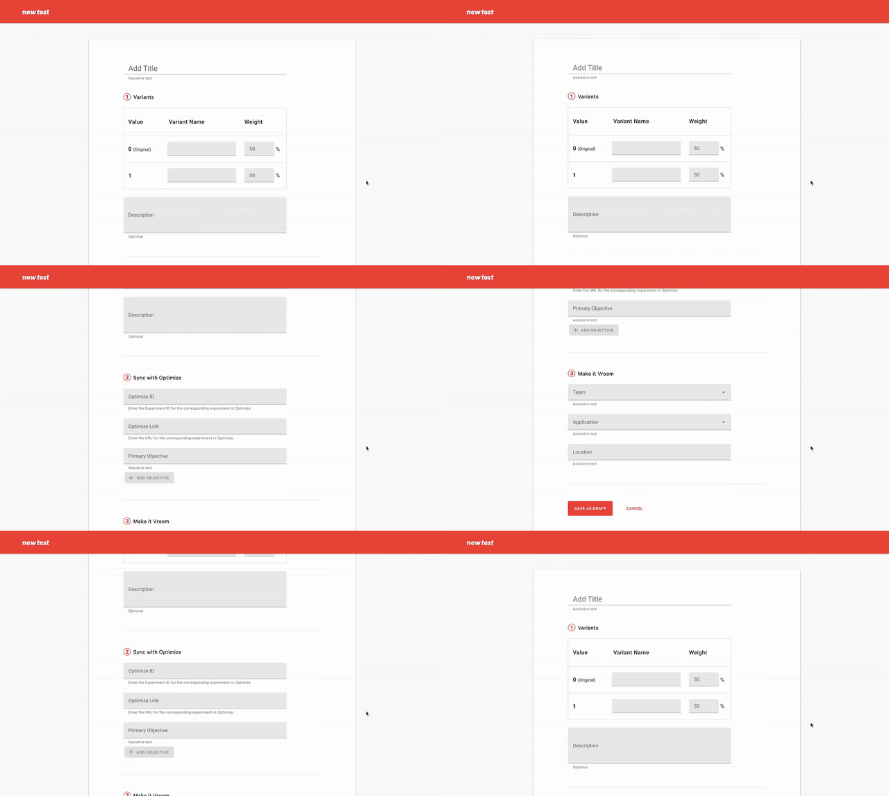
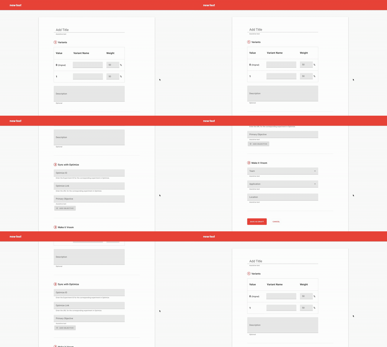
An early iteration of the New Test creation form with the single-column scrolling layout, similar to Optimize.However, ABT users were already experts in a/b testing. Speed was their top priority, yet v1 had a messy layout, making it difficult for developers to visually locate the exact input fields when copying test information from Optimize or Jira.
As a result, we decided on a two-column, single viewport layout to make all information discoverable at a glance. Over many iterations and feedback from user tests, we organized test information based on priority: the most relevant to test outcome (dates, variants, hypothesis, results, CTAs) on the left, and the logistical, ‘FYI’ type details on the right. By applying type hierarchy, negative space and surfaces thoughtfully, I aimed to make a information-dense page more scannable.
One caveat was that the full edit history would be below the fold. This was intentional to keep this low-touch section tucked in. Although the new layout would require some onboarding and learning, it was a trade off to design for scalability and further internal customization. To ease the transition from Optimize, we had kept things like general a/b testing terms and variant table layout consistent.
See all iterations below 👇
Extra credit 💯
With some extra time to explore, I made this illustration in Procreate to be displayed when the filters or the search return no results.
As well as using Illustrator and Photoshop to make this frame animation to be displayed in the dialog confirming the start of a test.
Impact
In our final presentation to Vroom’s whole tech organization, we received overwhelmingly positive responses. Although this tool was still in its pilot phase, we refreshed expectations of internal tools and provided a lasting experience that was smooth, energizing, and productive toward the business’ data-drive product strategy.
Stretch goals & opportunities
Test Trees
One consequence of the archive solution was that it implied an old, dusty cabinet that no one would touch anymore. In our interviews, the need to track and visualize follow-up challengers and related tests came up frequently, and there was a strong desire for the tool to serve as an insight repository. I therefore explord some early concepts of ‘test trees’ to represent these ‘chains’ of tests.
The visual representation of a 'test tree' was inspired by visual diagramming tools like Lucidchart. A tagging system could flexibly organize trees by any theme, and a 'learnings' section could clearly spell out insights that any user could reference.
Reporting
We saw an example of a test report slide deck that focused on outlining the number of tests run in each location as well as which tests won, lost, or did not have a significant result during a given time period. It was immediately clear that a filter on outcome would instantly sort out the latter aspect, which saved the manual labor of checking each test.
My tests
This was an interesting early exploration of the Test List Page in Kanban style. The drag-and-drop interactions between statuses would make the test lifecycle straightforward. I reserved this idea for a possible "My Tests" feature that would allow users to focus on managing tests they were responsible for. The limited number of ‘my tests’ would make scanning and scrolling still manageable in Kanban view.
Learnings
Working with cross-functional partners
Working with our Product Manager intern, Gui, I had a bird eye view of the project—how it fits into the company’s business goals and strategy—and learned to prioritize design features within the scope of the internship.
Working with our FE intern, Moustafa, we maintained a well-synced partnership. Because the app was built in Next.js and Typescript, we found that separating form and function allowed us to work most efficiently in a parallel fashion. Besides, I learned to deliver design specifications.
Taking feedback
As we iteratively evaluated our designs with RITE tests and critiques, I sometimes needed to let go of an idea or start work over from scratch. I’m grateful for all the Vroommates who helped each other raise the bar for quality. I’ve learned to put down my ego and embrace all the lo-fi explorations as part of the process — you’d never know until you visualize it!
7 interns + 5 sponsors over 10 weeks
9 sprints
64 ceremonies
282 Jira tickets
80+ introductions
436,792,324... “Do you see my screen?”
50+ “Who wants to start?”


