Portfolio Diversity: A Robinhood Case Study
Problem: Robinhood users who want to be more strategic with their investment lack the tools to evaluate the performance of their stock portfolios. As a result, they face difficulties making new investment decisions and trusting their ability to participate in the markets. I explored ways that users could visualize portfolio diversity on the Robinhood iOS app.
Solution: Ways to break down and visualize equity and return by different categories were designed and prototyped within 4 days (2020).
Prototype demo
Robinhood users struggle with investment decision-making without portfolio evaluation tools
Robinhood is a pioneer in commission-free stock trading with a mission to democratize finance for all. Providing a simple, gamified and futuristic investing experience, it has attracted 13 million users since its 2015 launch.
I had personally been a Robinhood user for 1 year and had mainly used the app to keep up with the stock market; however, I had been more hesitant in trading and growing my portfolio beyond several low-cost stocks. Starting from this observation, I set out to explore:
What are some barriers that may deter Robinhood users from participating in the market?
I talked to 3 current Robinhood users about their experience using the product as well as their beliefs and approaches to investing.
Lack of portfolio evaluation capabilities was a barrier to making informed investment decisions. At the time of writing, users could track the performance of each individual stock as well as the overall portfolio value. However, there was no tool within the app that provides a more granular understanding of the portfolio (how diversified it was, asset allocation, risk level, etc). This meant lack of key information that would inform the user on balancing risk and return in their investment.
With the time I had and knowledge with stock trading, I focused on designing for evaluating the diversity of a portfolio in this challenge.
Users considered investment as an iterative process; without evaluation, they became hesitant to take actions when it came to rebalancing portfolio and making recurring investments. Even if it is a small amount, users needed the feedback loop that fed into confidence in their investment strategy.
The online brokerage industry is highly competitive
Following Robinhood’s rise in popularity, big-name online brokers had eliminated commission fees since late 2019; trading activities had also surged since the pandemic.
Returning Robinhood users could quickly outgrow the platform. Although Robinhood had been continuously rolling out advanced trading features, it still struggled to keep up with users who wish to step up their game. Engaging these users would:
Drive revenue through new trading activities;
Increase retention and stickiness of users with varied levels of financial needs and comfort with volatility
Increase engagement from less active users
Design
* These designs assumed that the user had never used options trading or Robinhood Gold.
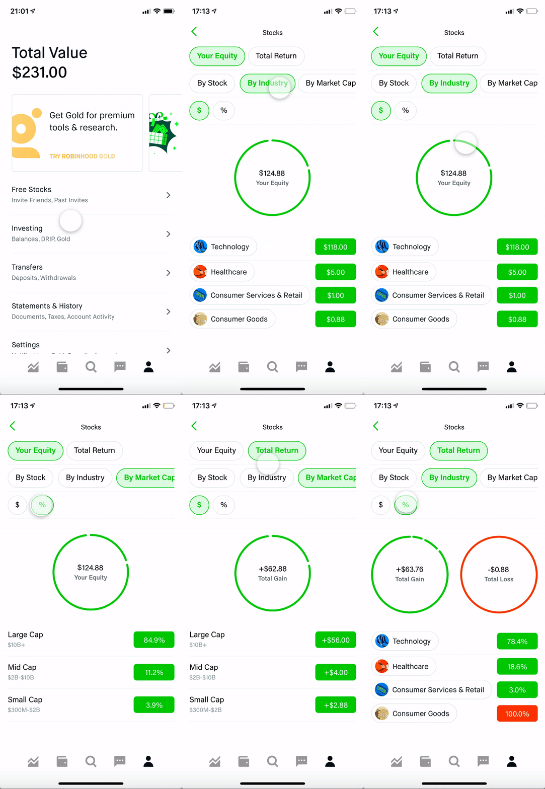
I started ideation by looking researching diversification strategies; for the scope of this challenge, I settled on using industry and market cap to visualize the diversity of both equity and return. Between sketches and hi-fi designs, I asked my interviewees for feedback over 2 rapid iterations.
Quick overview of portfolio diversity
BeforeOriginally, portfolio diversity % was only available in the stock detail page. I added a new option in the ‘Holdings Display Data’ menu to surface it in the Home tab.
I added a ‘Display Data’ dropdown that triggered the same interaction as tapping on the data blocks, as these blocks did not provide sufficient affordance for activating the bottom sheet.
➡️
Detailed portfolio breakdown
AfterI placed this feature under the Account tab for its retrospective, long-term view nature, in order to keep the Home/Portfolio tab focused on market moves for the day.
I used chip filters for the dollar value and percentage options. Because there were only two options, the interaction pattern on the Home tab of tapping the data blocks -> activating the bottom sheet required extra clicks and hid the options away. This was a tradeoff made for usability than design consistency.
Displaying the percentage breakdown for total return was tricky, because pie charts were not effective at visualizing negative values (loss). Therefore, I visualized gain and loss in separate charts. This was not the best solution for understanding the proportion of gain/loss in total net return, but it was the least confusing within the scope.
Stretch goals
Loading and empty state. A skeleton loader should be in place to set expectations when the potentially large number of data calls occur. For new users without any stocks in place yet, this could be a space for education, redirecting to help articles or CTA to get started with trading.
Visualize long term changes in portfolio diversity. A key component to building a diverse portfolio is rebalancing it regularly. It would be informative to plot how portfolio diversity changes over time, or see it at historical timestamps (e.g., 6 months ago).
Understand a wider range of user personas. For example, those who use Robinhood as a ‘casual trading’ platform can be more focused on real-time data on individual stocks rather than a holistic overview. If I were to do this challenge again, I would leverage online forum and social media to gather sentiments and comments and post a poll or survey if possible.
Breaking systemic barriers to finance. Robinhood published study results detailing barriers to the markets for women investors, such as fear of losing money and hesitation to discuss finances (which I very much relate to). It would be interesting to see if portfolio evaluation features could be empower women to invest more confidently.
2023 Update
Robinhood has launched a similar portfolio diversity feature displaying asset allocation and breakdown by sectors (industries). Throughout the years their interfaces have evolved to deemphasize color, and the bar representation of % in sectors was a nice visualization in addition to the number.


